
 Set for Student Project
 Lecture Note
 Lecture Video
 Activity
 Assignment
 Design Project
 Quiz & Exam

Scale Smart: Essential Tips for Choosing the Right Scale for Your Architectural Model

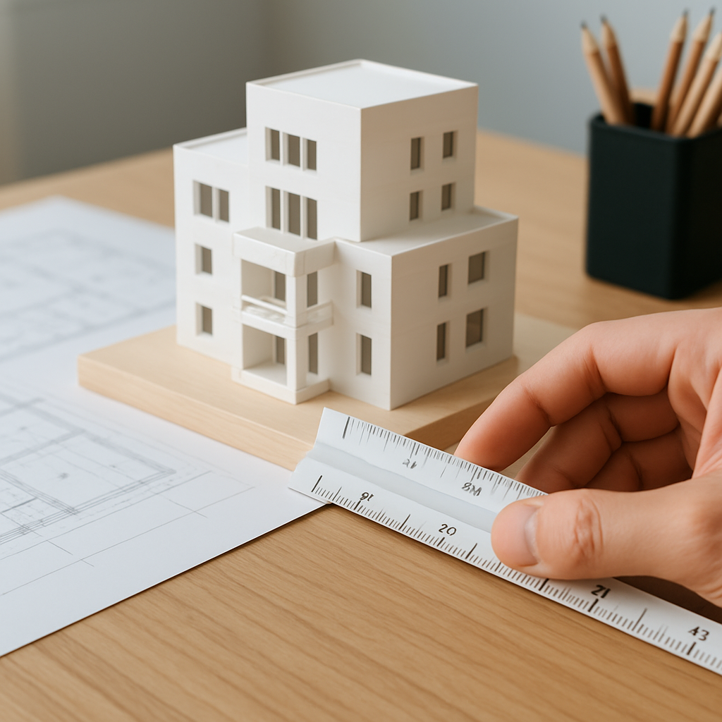
Why Scale Matters: The Foundation of Effective Architectural Models
When you’re ready to turn a design from an abstract idea into something tangible and three-dimensional, picking the right scale for your architectural model is much more important than it might seem at first glance. This isn’t just about making your model a certain size—it’s about setting the stage for how your work gets understood, how much detail you can show, and the overall impression your audience walks away with. It’s easy, especially if you’re new to model making, to just copy what someone else did or pick the first scale that sounds good. But honestly, that’s where a lot of models miss the mark. You’ve really got to think about what you want to communicate, who you’re talking to, and the nuts and bolts of building the thing. Get it right, and an ordinary massing study suddenly becomes a show-stopper. Get it wrong, and a beautiful concept might fade into obscurity. Let’s roll up our sleeves and dive into how you can make the smartest choice for your next architectural model.
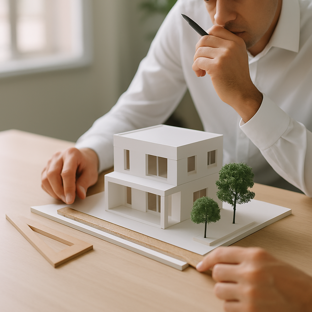
Let’s put this in perspective: imagine you have two models of the same building. One is at 1:1000 scale and fits comfortably in your hands. This version is perfect for showing how your building slots into its urban neighborhood, interacts with what’s around it, and faces the sun or the street. Now picture a 1:50 model—this one’s so big it’ll take up the whole table, but you can peek into rooms, appreciate the way light will spill through a window, and even admire how the staircase comes together. The scale you pick literally shapes the entire conversation you’re going to have with your viewers. It directs their attention—do they see the big picture, or the fine details? Seasoned architects know that getting this right can mean the difference between a successful pitch and a lukewarm reception at a planning meeting. The right scale lets your audience wrap their heads around your proposal instantly, without getting bogged down in clutter or missing the point entirely. That’s really the heart of architectural model making: making thoughtful, deliberate choices about scale right from the get-go. Trust me, it’ll save you headaches (and glue) later on.
Clarify the Model’s Purpose Before Picking a Scale
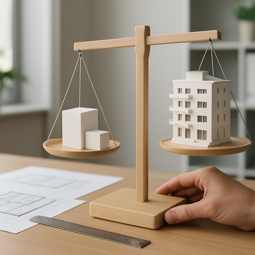
Here’s the thing: every architectural model has a job to do. Sometimes the goal is to wow a client and get them excited about your vision. Other times, you’re testing massing ideas or showing nitty-gritty construction details to the engineer. So, before you even touch your materials, ask yourself—what exactly do I want this model to accomplish? If you’re just trying to see the overall shape and how the building sits on its site, a smaller scale (like 1:500) keeps the focus right where it should be—on mass and spatial relationships, not on, say, the hinges on a door. On the other hand, if you need to communicate the finer points—like window frames or how two materials meet—you’ll want to scale up, maybe to 1:50 or even bigger.
And think about who’s actually going to interact with your model. If it’s a client, they probably don’t care about every little HVAC vent. But if you’re talking to the builder, those details suddenly matter a lot. Or maybe you’re presenting to a city planning board—in that case, showing how the building fits into the bigger urban picture at 1:1000 could make your case way more effectively than a super-detailed interior model. Imagine your model as a storytelling device—its scale is like your lens, focusing attention on what really matters for that particular audience.
There’s also nothing wrong with making more than one model at different scales. In fact, it’s pretty common practice on bigger projects. You might start with a 1:1000 site model to nail down massing decisions, then later build a 1:50 interior model to sell your vision of the spaces inside. This sort of multi-model approach can be a real game-changer if your project is complex.
Take, for example, a firm designing a new community center. They might kick things off with a 1:1000 model to show how the building fits in with the surrounding streets, green spaces, and parking lots. Once everyone’s on board with the concept, maybe they whip up a 1:200 model to hash out interiors and circulation with the team. Later, a crisp 1:20 sectional model helps nail down details like window profiles, seating, or custom cabinetry for the contractors and makers. Each model is tailor-made for a specific audience and phase of the project, and each one leverages scale as a strategic design tool. This layered approach isn’t just about making things look cool—it helps you spot problems early, before they become expensive headaches, and ensures your model always hits the right note.
And let’s not forget—these days, digital tools let you test things out virtually before you ever cut the first piece of foam board. Most architects play with different virtual scales in their 3D software, swapping between big-picture and detail views to see which parts need to be highlighted in the physical version. This hybrid workflow helps you focus on what really needs to be built and makes sure your time (and budget) go where they’ll have the most impact. In the end, the best architectural models have a crystal-clear purpose and a scale that brings that purpose into sharp focus for the intended audience. It’s all about being intentional and strategic from the start.
Balance Detail, Size, and Practical Constraints
It’s fun to dream up epic, ultra-detailed models, but sooner or later, reality chimes in. The bigger the scale, the more detail you can—and, realistically, have to—include. But that comes with trade-offs: more time, more money for materials, and a bigger chunk of your workspace (or living room floor). For example, a 1:25 model lets you show off jaw-dropping interiors and maybe even tiny furniture, but if you’re modeling a multi-story building, be ready for a model that’s awkward to move and tough to store. At the other end, a 1:1000 model is feather-light and easy to carry, but you’re not going to impress anyone with its lack of detail.
It’s worth taking a good look at your workspace and how you’ll actually use the model. If you’re working in a cramped studio or need to lug your model from meeting to meeting, sticking to a smaller scale is just smart. Don’t forget about materials, either. Some tiny features just aren’t feasible with standard supplies—laser cutters and 3D printers can help, but not everyone has those on hand. And wow, the time it takes to design and assemble all those tiny parts—don’t underestimate it! What seems manageable at first can quickly snowball into an all-consuming project as scale increases.
Human perception is another thing people often overlook. We use familiar objects—like miniature cars or trees—to help viewers “read” the model. But at a certain point, especially when you go really small, these references become so tiny they barely register. At 1:500, for instance, a car shrinks to just over 3mm long. That’s smaller than your pinky nail—hardly a showstopper!
Picture this: You’re tasked with building a 1:50 model of a four-story apartment block. You’re not just making exterior walls and floors; suddenly, you’re adding stairs, balcony railings, doors, windows, and even miniature furniture if you want to capture how people might actually use the space. Each additional detail cranks up the complexity. Now you’re looking for—or hand-crafting—tiny chairs, delicately painting fixtures, or even engineering doors that swing open. Meanwhile, a 1:1000 version of the same building? That might fit on a piece of foam board hardly bigger than a sheet of printer paper, with just a few block shapes and some paint to get the idea across. The difference in materials is just as stark—the big model eats up sheets of acrylic or balsa wood, while the tiny one might be cobbled together from leftover cardboard and a dab of glue.
Your practical approach to making the model matters, too. If you’ve got a 3D printer handy, it’s possible to add impressive detail at small scales that would be a nightmare by hand. But if you’re working the old-school way, hand-cutting pieces one by one, you’ll probably find that bigger scales are more forgiving and your craftsmanship shines through. Many pros keep bins of pre-scaled people, trees, and vehicles to give their models life and context—but sometimes, finding these bits for oddball scales is a serious challenge. In short, balancing your ambitions with limitations is what separates experienced model makers from the rest. They know when to go all-in on details and when simplicity will get the job done more effectively (and save them a few gray hairs in the process).
The Most Common Scales: When and Why to Use Each
While you’re technically free to pick any scale you like, there’s a reason some standards have stood the test of time. Here’s a rundown of the most popular scales for architectural models, and what makes each one shine:
- 1:1000 / 1:500: These are your go-to scales for urban planning, site analysis, or showing how a new building fits into a bigger picture. At these sizes, it’s all about massing and context—don’t worry about the fiddly details. A whole city block feels manageable at 1:1000, while 1:500 lets you sneak in a few more site features or the overall shape of each structure.
- 1:200 / 1:100: Think of these as the workhorses of architectural presentations. At 1:200, you can show room layouts, windows, and even some landscape. Scale up to 1:100, and now you’re able to get into floor plans and circulation, maybe even suggest some basic interior elements. Most client presentations land right in this sweet spot.
- 1:50 / 1:20: At these scales, you’re in detail heaven. Perfect for interior design models, furniture layouts, joinery, or stairs. If you want someone to really imagine walking through the rooms, or you need to sort out construction details before the real build, this is where you want to be.
- 1:10 and larger: Honestly, these are specialty scales. You’ll mostly see them when someone’s prototyping furniture or working out joinery for doors and windows. They’re fantastic for hands-on exploration but, unless you have an airplane hangar, not practical for full buildings.
Keep in mind, you’re not locked into these exact numbers. Maybe 1:75 works better because you’ve got a specific display case or you’re trying to balance wow factor with portability. The key is to pick a scale and stick with it—make sure everything in your model is sized consistently so viewers don’t get thrown off.
If you want a real-world example, picture a big public project—a museum, let’s say. The team might start with a 1:1000 model to show how the building fits into the city. As things move forward, maybe a 1:200 or 1:100 model appears, where you can actually spot the entrance plaza, landscaping, and key interior spaces. When it comes to designing a gallery or reading room, a detailed 1:20 model might be rolled out to explore how light falls on artwork or how visitors will move through the space. For residential or commercial developments, models at 1:100 or 1:200 are popular for marketing—they’re big enough to show off features like balconies or communal pools, but still small enough to haul to an exhibition or fit in an office window.
The beauty of sticking to standard scales is you gain access to a whole world of ready-made accessories—trees, cars, people, even streetlights—all sized perfectly for your model. Manufacturers know what architects need, so you’ll find supplies at 1:100, 1:200, and 1:500 all over the place. And if you’re working with international teams or presenting to a city board, using a common scale ensures your model speaks a universal language, reducing the risk of someone misunderstanding your vision—or, worse, making a costly mistake.
There’s also something to be said for consistency. If you’ve got a collection of models at 1:500, it’s incredibly easy to compare new proposals with past projects or explain changes to a neighborhood over time. This is crucial in master planning—stakeholders love seeing how a site evolves stage by stage, and a consistent scale makes those stories clear and compelling.
Tips for Choosing—and Sticking With—the Right Scale
Once you’ve taken all the factors into account, it’s time to actually pick a scale and run with it. Here are some tried-and-true tips to help you make the right call and avoid headaches along the way:
1. Start with your drawing set. It’s so much simpler if your physical model matches the scale of your digital drawings or blueprints. If your plans are drawn at 1:100, for instance, making your model the same scale keeps measurements straightforward and makes translating details a breeze.
2. Try a scale mock-up. Before you spend hours (or days) building something that doesn’t fit, print or cut out a basic outline of your building at a few different scales and place it on your baseboard or site plan. This quick experiment helps you visualize the finished size and avoid surprises later—like realizing your “table-top” model is actually the size of a surfboard.
3. Consider your audience’s expectations. Professionals will expect certain standards—if you’re presenting to architects or engineers, don’t stray too far from industry norms. For clients or public exhibitions, though, it’s sometimes better to prioritize visual clarity and appeal over technical accuracy. Pick the scale that works for the people you’re communicating with, not just what feels most comfortable for you.
4. Don’t forget the extras. Details like landscaping, cars, people, and signage add realism and life to your model, but they’re not always available in every scale. Make sure you can get accessories that fit—or are willing to fabricate them—so your model doesn’t end up looking sparse or inconsistent.
5. Document your choice. Always, always label your model (and any related drawings or materials) with the scale you used. This avoids confusion, especially if you’re juggling several models at different scales or collaborating with others. Trust me, nothing derails a presentation faster than an audience unsure what they’re looking at.
Let’s walk through a practical example. Imagine you’re designing a small retail pavilion. You review your plans at 1:100 and print an outline at that scale. It fits perfectly on your display board, with just enough room left for landscaping and a few pedestrian figures. You check your supplier and, fortunately, benches, trees, and people at 1:100 are all readily available. When you construct the final model, you clearly mark the scale on the base so everyone—clients, engineers, consultants—knows exactly what they’re seeing. You even add a couple of 1:100 figures to show how customers will interact with the space—something you’d lose if you went much smaller.
Staying consistent with your chosen scale is just as crucial as picking it in the first place. Resist the urge to add a little tree or car at a different scale “because it looks cute”—that just confuses viewers and makes your model look amateurish. If you really need to highlight a detail that can’t be shown at your main scale, build a separate, larger-scale model or an exploded detail. Keep your main model consistent, especially for public displays or regulatory submissions, where accuracy matters as much as aesthetics.
A Mindset for Success: Flexibility and Experimentation
Here’s the bottom line: there isn’t one “right” answer for choosing the best scale for an architectural model. What matters is that you make a conscious, thoughtful choice based on your objectives, limitations, and—most importantly—your audience. Don’t be afraid to push the envelope a little. Some of the most memorable models break the rules, combining scales or using exploded views to highlight features you’d otherwise miss.
Maybe the best advice is to see scale not just as a technical constraint, but as a creative part of your overall design process. Every decision you make about scale shapes the narrative your model tells. Are you inviting people to imagine themselves walking through sunlit rooms, or showing off the dramatic way your building transforms a city block? That one choice—what scale to use—can change the way people relate to your design in surprising ways. So approach scale with a sense of curiosity and confidence, not fear. You might be surprised at just how much creative leverage you find in this part of the process.
Think about some of the iconic models at the Venice Architecture Biennale. Many feature several scales within a single display—a detailed 1:20 slice of a façade embedded in a sprawling 1:500 site context, for example. This kind of experimental approach connects the big picture with the tactile, material experience of the architecture, sometimes sparking ideas no one had even considered. Or consider the “exploded” axonometric models, where parts are separated and scaled up to showcase construction sequences or spatial organization. These don’t just communicate information—they become conversation pieces in their own right, drawing in viewers and making the project unforgettable.
Flexibility also means being ready to change up your process as your project evolves. Early on, you might crank out rough models at a big scale just to play with ideas, then switch to refined, detail-rich models as things come into focus. Embracing this iterative way of working helps you adapt to feedback, test out alternatives, and make sure your final model tells your story loud and clear. The goal of playing with scale isn’t to box yourself in—it’s to unlock new ways of seeing and explaining your ideas. Treat each project as a chance to experiment a little, and you’ll find that the right scale can turn even the simplest model into something that sticks with your audience long after they leave the room.


