
 Set for Student Project
 Lecture Note
 Lecture Video
 Activity
 Assignment
 Design Project
 Quiz & Exam

Scale Matters: How to Choose the Perfect Scale for Your Architectural Model

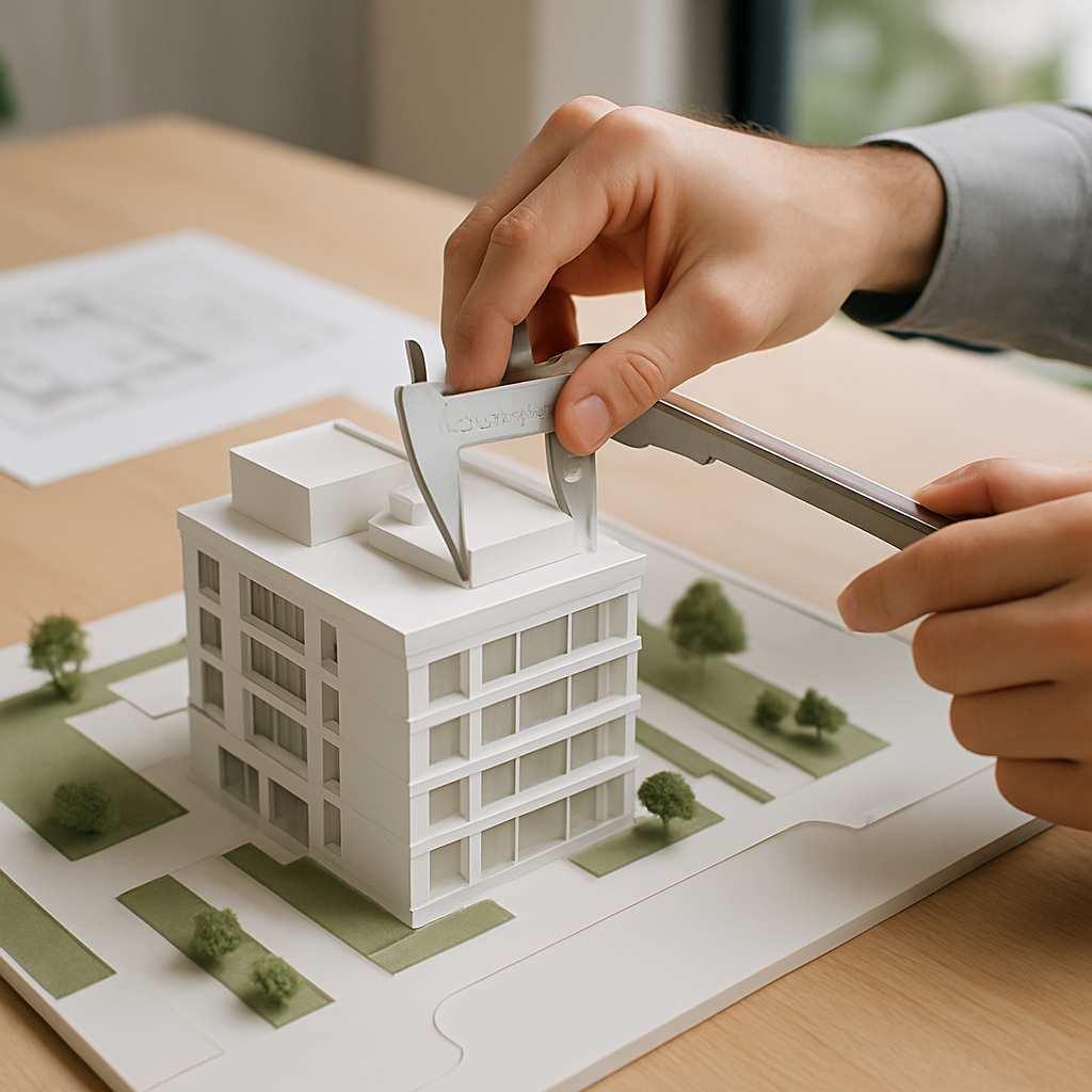
Understanding the Role of Scale in Architectural Models
Let’s be honest: when you’re about to dive into building an architectural model, the question of scale can feel like a big, looming hurdle. It’s often one of the first decisions you have to make, and, trust me, it’s a decision that can set the tone for the whole project. The scale you settle on doesn’t just tweak the math—it changes how people see, interpret, and even feel about your design. Whether you’re a wide-eyed student tackling your first studio model or a seasoned pro gearing up for a high-stakes client pitch, choosing the right scale for an architectural model isn’t just another checkbox. It’s a thoughtful, strategic move that’s bound up with the very goals and context of your project.
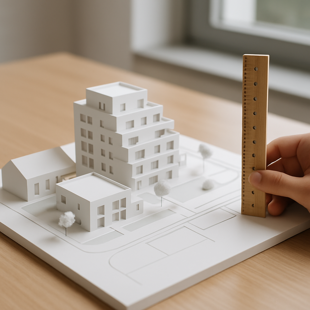
Scale, at its core, is more than a simple mathematical conversion—it’s like slipping on a particular set of glasses and inviting others to see your vision through them. A 1:100 model gives you that bird’s-eye perspective, highlighting the overall form and relationships, while a 1:20 scale lets you really get in there and explore the fine details. And with so many standards—1:500, 1:200, 1:50, you name it—it’s no wonder that choosing can feel a bit overwhelming. But before you automatically reach for the “usual” option, pause and ask yourself: what’s the real job of this model? Is it meant to illustrate a sprawling masterplan, untangle a tricky structural system, or spotlight the intricacies of a single façade? Every purpose calls for its own approach to scale, and figuring this out early can be a real lifesaver—saving you headaches down the road and making sure your design intent comes through loud and clear.
Take students as an example. It’s easy to default to a 1:100 scale because that’s what everyone else in the studio seems to be doing. But suppose your project is all about how a new building fits into an existing block or campus. In that case, a little shift to 1:500 might serve you better, offering the bigger picture and a sense of how your proposal interacts with the city around it. On the flip side, if you need to wow your jurors or professors with a show-stopping staircase detail, you’ll want to upsize to 1:20 or even 1:10. At that scale, you can really dig into the mechanics—letting everyone poke, prod, and scrutinize how things come together in the real world.
It’s also worth remembering that scale is deeply tied to how we, as humans, experience things. A model at 1:500 might feel a bit abstract, but it’s brilliant for showing things like movement patterns, connections, or how your building might pop up on the skyline. Now, shift to something like 1:50, and suddenly you can picture yourself walking through the rooms, imagining what it’d be like to actually inhabit the space. This seesaw between abstraction and realism means that as the designer, you’re in the driver’s seat. Your choice of scale becomes a tool—not just to shrink reality, but to communicate and persuade. In the end, a great architectural model isn’t just a mini version of the building—it’s an intentional, hands-on way to tell your story and invite discovery.
Matching Scale to Purpose: From Site Plans to Interior Details
No two architectural models are created for the same reason, and that’s why your scale choice absolutely has to support your specific goal. If you’re working on something big—urban plans, campus layouts, or city-wide proposals—you’ll usually find yourself working at scales like 1:500 or even 1:1000. These large-scale models are perfect when you need to highlight the relationships between buildings, how traffic moves, or where green spaces pop up. Sure, you’ll lose the tiny details, but you gain a bird’s-eye clarity that’s hard to beat. If you’re hoping to show how your project fits in with the bigger scene, this is often your best bet.
Take city planning departments, for example. They frequently roll out 1:1000 scale models to get everyone—engineers, politicians, and neighbors—on the same page about zoning, density, or new infrastructure. It’s so much easier to see how one new tower might affect traffic or cast shadows across a park when you can view it in context. Similarly, when an architectural firm tackles a new university campus, a 1:500 model lets administrators or student reps instantly grasp how new dorms, lecture halls, and courtyards could work together, making the long-term vision feel much more tangible.
Now, if your project zeroes in on a single building, scales like 1:200 or 1:100 hit that sweet spot. At these sizes, you’re able to show off the building’s massing, how the façade plays out, and a sensible sketch of the basic interior layout. You won’t get bogged down trying to craft dollhouse furniture, but you’ll still communicate enough for clients and design teams to “see” the concept. These scales are a go-to for design reviews and client meetings, offering recognizable details without overwhelming you (or your workbench) with fiddly pieces.
For instance, imagine a developer pitching a new office block to potential tenants. A 1:100 model is big enough to show where the offices, lobbies, and break areas are—maybe you’ll even add simplified chairs, staircases, or window divisions. It’s not about miniaturizing every feature, but about creating something that lets people picture themselves using the space. You get to communicate scale and intention without the model becoming unwieldy or, let’s face it, a full-time job just to finish.
But, when the goal is to really get into the nitty-gritty—like showing off a unique façade section or explaining how a wall goes together—you’ll want to jump up to 1:50, 1:20, or perhaps even 1:10. These larger scales allow you to get hands-on with interiors or construction details. If you’ve ever tried to explain window insulation or a tricky corner detail to a client using just drawings, you know how helpful a physical 1:20 section can be. Here, your model isn’t just a presentation piece—it becomes a working tool for problem-solving, feedback, and collaboration. The rule of thumb? Let your purpose drive your scale, not the other way around.
Out in the field, construction teams really appreciate larger-scale detail models—think 1:10 or 1:5—especially when tackling complex assemblies like curtain walls, custom staircases, or special joinery. These models help installers spot hiccups before they crop up on site, saving time, money, and plenty of headaches. Interior designers, too, will often put together a 1:20 model of a hotel room or suite, playing with furniture, lighting, or color schemes so both designers and clients can actually feel the vibe of the space before anything gets built for real.
In the end, lining up your model’s scale with what you need it to do is a strategic move. It doesn’t just make your communication sharper—it makes your design process smarter, too, and helps everyone involved understand exactly what you’re aiming for.
Balancing Practical Constraints: Space, Time, and Budget
As much as we might dream of creating the perfect model at the ideal scale, real life tends to get in the way. Space—both on your work table and wherever you plan to present the model—can make or break your ambitions. A 1:100 model of a moderate-sized building will probably fit comfortably on a desk. But if you try to model a whole city block at 1:50, you’ll run out of room before you even finish the first street. So it’s smart to think ahead: Will you need to bring this model to a client meeting across town? Does it have to squeeze into your studio apartment or a packed conference room? If it’s got to travel, a larger scale may be a non-starter.
Picture a student working at a tiny kitchen table, or a professional with just a conference table at their disposal—the realities of daily life put a spotlight on scale and how you break up your model. An architecture firm prepping for a big competition might build the main design at 1:200, while attaching a separate, larger-scale model of a dramatic entrance or key detail. This approach covers both context and focus areas, all without forcing you to rent a moving van just to get your model across town or down a hallway.
Then there’s the clock—time is always ticking. The difference between putting together a quick 1:200 massing model and laboring over a highly detailed 1:50 section is no joke. Those extra days (or even weeks!) add up fast, especially for students racing to meet a studio deadline or pros hustling for a competition. Sometimes, it pays to be strategic: what absolutely needs to be built, and what could just as easily be shown with a drawing or computer model? More and more, hybrid models—mixing physical and digital elements—offer a smart compromise, so you can concentrate your time (and budget) on the stuff that really counts.
Rapid prototyping has really changed the game here. Tools like 3D printers and laser cutters make it possible to create intricate model pieces fast and with impressive accuracy. You can use these technologies to fabricate the most detailed elements at a large scale and keep the rest more basic and manageable. But let’s not kid ourselves—even with high-tech tools, crafting a polished, believable model still takes a lot of time, especially if you’re adding paint, landscaping, or tiny lights. That’s where careful planning comes in—deciding which parts demand close-up detail and which can stay abstract can make or break your timeline (and your sanity) as the deadline looms.
And of course, the bigger and more detailed your model, the more it’ll cost. High-precision materials and special components can get expensive fast at larger scales. It’s totally okay to build a partial or sectional model if a full-building version would blow your budget (or break your back). Sometimes, a beautifully crafted slice—a model of just one classroom at 1:50, for example—says more to your audience than a sprawling, but less considered, whole campus.
For instance, modeling an entire school at 1:50 would not only be pricey but would also require a warehouse for storage. Instead, zeroing in on a single classroom or a community hub at that scale helps people really grasp your design’s key features and materials. Architects are pros at mixing and matching: foam board or chipboard for the big, less-important chunks, 3D-printed plastics for complex but less focal areas, and then saving the real treats—wood veneer or clear acrylic—for signature spaces. By divvying up your resources, you make sure the most important elements get the attention (and the funds) they deserve without blowing your whole project on one massive model.
When you face up to these constraints—space, time, budget—not only do you keep your project grounded in reality, but you often spark more focused, creative presentations. And sometimes, those limitations are exactly what help you clarify your priorities and end up with a model that’s more effective, memorable, and, well, doable.
Bridging Communication Gaps: Audience and Scale Selection
Here’s something people often overlook: the scale you pick isn’t just about what you want to show—it’s about who you’re showing it to. Seasoned architects or engineers? They’re usually able to read any scale, mentally filling in gaps and imagining the details. But if your audience includes clients, city officials, or members of the public, you’ll want to make your model as accessible as possible. At 1:100 or 1:50, people who don’t live and breathe architecture can picture doors, windows, and rooms in a way that makes sense. It’s all about helping everyone connect to the project, no matter their background.
Think about a public consultation for a new apartment block. If you show up with a 1:100 model, neighbors and city council members can see where the new buildings will sit, how they’ll change the street, or even how much sunlight the park across the way will get. Adding little clues—cars, trees, tiny people—at this scale really helps folks picture how things will feel in real life. Even simple touches like using green for landscaping or color-coding building types can unravel complicated site plans for people who aren’t used to reading them.
It’s also worth mentioning the storytelling power of scale. When your model is at a human scale—with recognizable figures, trees, or benches—it invites viewers to imagine themselves right in the middle of the action. That emotional connection can make all the difference, especially when you’re seeking approval or trying to win hearts and minds. Conversely, a model that’s too tiny or abstract might leave people cold, making it harder to get your ideas across.
Take corporate presentations—a 1:50 model of a new office headquarters, complete with little desks, chairs, and even “employees,” can be surprisingly powerful. Executives or clients can picture workspaces, meeting rooms, and communal areas, and suddenly, the project feels real and attainable. If you only have a flat site plan or a computer rendering, you might find your audience zoning out or struggling to see the final vision. For public exhibitions, interactive models at approachable scales encourage people to get involved and spark conversation, building excitement and buy-in around the design.
Don’t forget, you don’t have to stick to just one scale. Sometimes, mixing things up is the best strategy. Maybe your big site model is at 1:500, but you swap in a detailed 1:100 section for the star building. This modular tactic lets you zoom in and out as needed, tailoring your presentation to different audiences and situations. In the end, the most successful architectural models are those that anticipate their viewers’ needs and deliberately choose scales that make the message clear and memorable.
Some design offices take it a step further with expandable models—modular sections that snap together magnetically or slot into place, each at a different scale. Say you’re presenting an urban plan: start with the whole city at 1:1000, then pop in a 1:200 neighborhood segment or a 1:50 slice of a key building. This keeps your presentation lively and holds everyone’s attention, whether they’re big-picture planners or detail-obsessed stakeholders.
Trends and Innovations: Rethinking Scale in the Digital Age
Technology hasn’t just shaken up architecture—it’s completely changed how we think about model-making and scale. With digital fabrication tools like 3D printers, laser cutters, and CNC mills, it’s now possible to achieve jaw-dropping detail at much smaller scales. The lines between what belongs in a physical model and what’s best left to drawings or renders keep blurring. You can go wild with intricate façades or detailed interiors at 1:200 or 1:100 if you have access to the right tech and a bit of digital know-how.
For example, 3D printing opens up whole new worlds—whether that’s printing highly detailed parametric facades, custom stairs, or even recreating the slopes and dips of the landscape itself, all at a tiny scale. Laser cutting, too, lets you etch out window frames and grilles with impressive accuracy, giving your model a realism that once required a bigger, chunkier scale. Some offices are experimenting with 3D-printed furniture or even adding tiny lights to 1:50 models so you can really get a sense of how the building will look and feel, inside and out.
But that’s not all. Augmented reality (AR) and mixed-media approaches are rewriting the rules for scale altogether. Imagine overlaying digital information onto a simple, physical massing model—suddenly, your audience can zoom in, peel back layers, or toggle between different design options without making a mountain of physical models. This hybrid approach lets you keep your model manageable in size while making it much more interactive and revealing.
Some forward-thinking firms are already using tablet-based AR apps, which recognize markers on a physical 1:500 site model and project advanced overlays—showing things like movement routes, daylight studies, or alternate facades. Clients (and even the most tech-averse board members) can explore these digital layers by simply moving an iPad or phone around the physical model, uncovering insights that would otherwise need entire sets of models or endless PowerPoint slides. Mixed-media models, where a classic cardboard base is animated with digital projections or screens, are also gaining traction. Want to show how sunlight shifts in a courtyard or how crowds might use a plaza? Just add a projection or animation, and your static model comes to life.
Still, despite all these shiny new tools, the basics haven’t changed: your scale must serve the mission of your model. It’s tempting to let new tech lead the way, but start with your story—figure out what you want your audience to understand, then pick the scale (and the method) that brings that vision to life. When you align scale, story, and technology, you don’t just make a model—you make a lasting impression, standing out in a world where everyone’s fighting for attention.
As physical and digital modeling keep blending together, architects and designers have more tools than ever to create models that are impactful and memorable. The projects that really shine are the ones where scale is chosen with intention, the communication goals are clear, and the digital tricks are used to serve—not overshadow—the message. Whether you’re gluing foam board in your garage or setting up an AR display in a boardroom, remember: scale isn’t just a number or a formula. It’s the backbone of your architectural story, shaping how ideas are shared, understood, and ultimately brought to life.


